Colour Trends 2024
We always really look forward to the colour trends for the year so that we can start thinking of ways to incorporate them into upcoming designs. Use these colour palettes as a springboard and as inspiration for how you’d like to include these colours in your home. Plus, if you enjoy the colours that will be popular in 2024, you’ll have a much easier time finding pieces in these tones to include in your home. For the upcoming year, we’re going to be seeing an extension of the blue and green tones that were popular in 2021, but with a more saturated feel to them. We’ll also be seeing a lot of natural and neutral palettes, warm and earthy palettes, as well as palettes with deep rich tones. It’ important to remember to pick and choose where and if you’d like to incorporate these colours into you home as you’ll want to make sure that they work with your style!
Natural & Neutral
We love a natural and neutral colour scheme because it’s such a great backdrop for adding different coloured accents that you can change with the seasons (or anytime you’d like). But, remember that this never means boring. When going with a more natural or neutral colour scheme, make sure to play with a lot of texture, and mix and match matte with glossy finishes, which will add visual interest. In the photo on the left, this room is done in a number of natural tones, but the different finishes create a lot of dimension. This room mixes sheer curtains with smooth linen, white washed and well as natural warm woods and a warm woven leather bench to create a lot of layers. In the photo on the right, the neutral wall colour, millwork, couch and armchairs create the perfect canvas on which to add a little bit of contrast through the light fixture, coffee table and accessories.

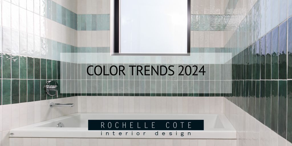
Greens & Blues
These natural, earthy tones add sophistication and maturity to our more neutral palettes, while instilling a sense of calm. They’re colours that represent the outdoors and allow us to bring a little of our favourite forest or ocean into our spaces. When looking for rooms to use blue or green in, you’ll want to focus on rooms that need a bit of extra tranquility or grounding. In the photo on the right, this pleasing deep blue grounds the island and adds some personality to this otherwise fairly neutral space. It adds just enough colour without overwhelming the eye. In the photo on the right, we love the use of these vertical green subway tiles in the walk in shower. They add a very calming feel, making it seem like you’re showering in the rainforest among the trees.

Warm & Earthy
In 2024, we’re going to see an increase in warm tones being used throughout interiors, with an emphasis on textural, handmade elements. Adding these warmer tones can quite literally make your home feel warmer and more inviting, so why not try adding a few pops of these colours?! In the photo on the left, we see a kitchen done in a beautiful warm wood. This adds a very luxurious vibe to the kitchen and really emphasizes the craftsmanship of all the cabinetry. To not make it feel too simple, the island is wrapped in a fluted wood which adds texture and personality. In the photo on the right, a lot of the warmth comes from the cognac coloured leather sofa, but don’t discount the accessories in the room. An organic wooden sculpture is beautifully displayed on the coffee table and is complemented by the washed wood side tables. To round out the look, we’re seeing some of the blue tones mentioned earlier and a lighter wood mirror along with some natural pampas grass for texture.

Dark & Rich Tones
We can’t forget about adding some dark and rich tones in 2024 to create contrast, or a dramatic moment in a room. Like the warm and earthy tones, these darker shades add a lot of richness to a room, especially when done in a fabric as luxe as velvet. In the photo on the left, these oversized chairs done in a warm copper colour strike the perfect balance. They’re modern and streamlined in a rich colour, but still look incredibly cosy and comfortable - perfect for curling up in with a book. In the photo on the right, this darker burnt orange colour makes for a truly dramatic bed frame. When choosing a statement piece like this, it’s important to keep the rest of the bedding minimal - as shown here - to make sure that the bed isn’t overshadowed.

Photo Credit: Shellard Photography
